TL;DR The introduction of Web Components have given developers super powers. With Web Components, web designers and developers are no longer limited to the existing HTML tags that existing browser vendors provide. Developers now have the ability to create new custom HTML tags, enhance existing HTML tags or extend components that developers around the world have created. In this article, I'll show you how to use and create custom web components for your apps.
Web components allow for reusability and the ability to associate JS behaviour with your markup. Developers can search for existing components created by other developers on the web components registry. In the absence of suitable existing custom elements, developers can create theirs and make it available for others by publishing it to the registry.
What are Web Components?
Web components are a set of web platform APIs that allow you to create new custom, reusable, encapsulated HTML tags to use in web pages and web apps. They are reusable widgets that are built on the Web Component standards. Web Components work across modern browsers and can be used with any JavaScript library or framework that utilizes HTML.
There are some sets of rules and specifications that you need to follow to develop web components. These specifications are classified into four categories:
- Custom Elements
- Shadow DOM
- HTML Imports
- HTML Template
We'll talk about these specifications in the latter part of this post. But let's quickly learn how to use web components.
How to use Web Components
The first step is to browse the element registry. Check for the components that you are interested in, then go through the README to know how to import it and use in your web applications.
The web component registry has two main sections:
- elements: These are custom elements in the registry.
- collections: These are sets of custom elements. An example is the awesome-chart-elements collection that contains eight awesome elements for working with charts in a web app.
An example web component you can install is juicy-ace-editor. You can install it by following these processes:
Make sure you have bower installed, else run:
npm install -g bower
Now install the
ace-editorbower install juicy-ace-editor --save
Create an
index.htmljuicy-ace-editor<link rel="import" href="bower_components/juicy-ace-editor/juicy-ace-editor.html">
and place the component on the page like this:
<juicy-ace-editor theme="ace/theme/monokai" mode="ace/mode/javascript"></juicy-ace-editor>
This is an example of the component in the
index.html<!DOCTYPE html> <html lang="en"> <head> <meta charset="UTF-8"> <title>Document</title> <script src="bower_components/webcomponentsjs/webcomponents.min.js"></script> <link rel="import" href="bower_components/juicy-ace-editor/juicy-ace-editor.html"> <style type="text/css"> #editor-container { position: absolute; top: 0px; left: 280px; bottom: 0px; right: 0px; background: white; } </style> </head> <body> <juicy-ace-editor id="editor-container" theme="ace/theme/monokai" mode="ace/mode/javascript"> var User = require('./controllers/user.server.controller'), Notification = require('./controllers/notification.server.controller'); module.exports = function(app) { app.get('/api', User.welcome); app.post('/api/users', User.createNewUser); app.delete('/api/user/:user_id', User.deleteOneUser); app.post('/api/notify', Notification.notifyUsers); }; </juicy-ace-editor> </body> </html>
In the code above, we referenced a script:
<script src="bower_components/webcomponentsjs/webcomponents.min.js"></script>
The
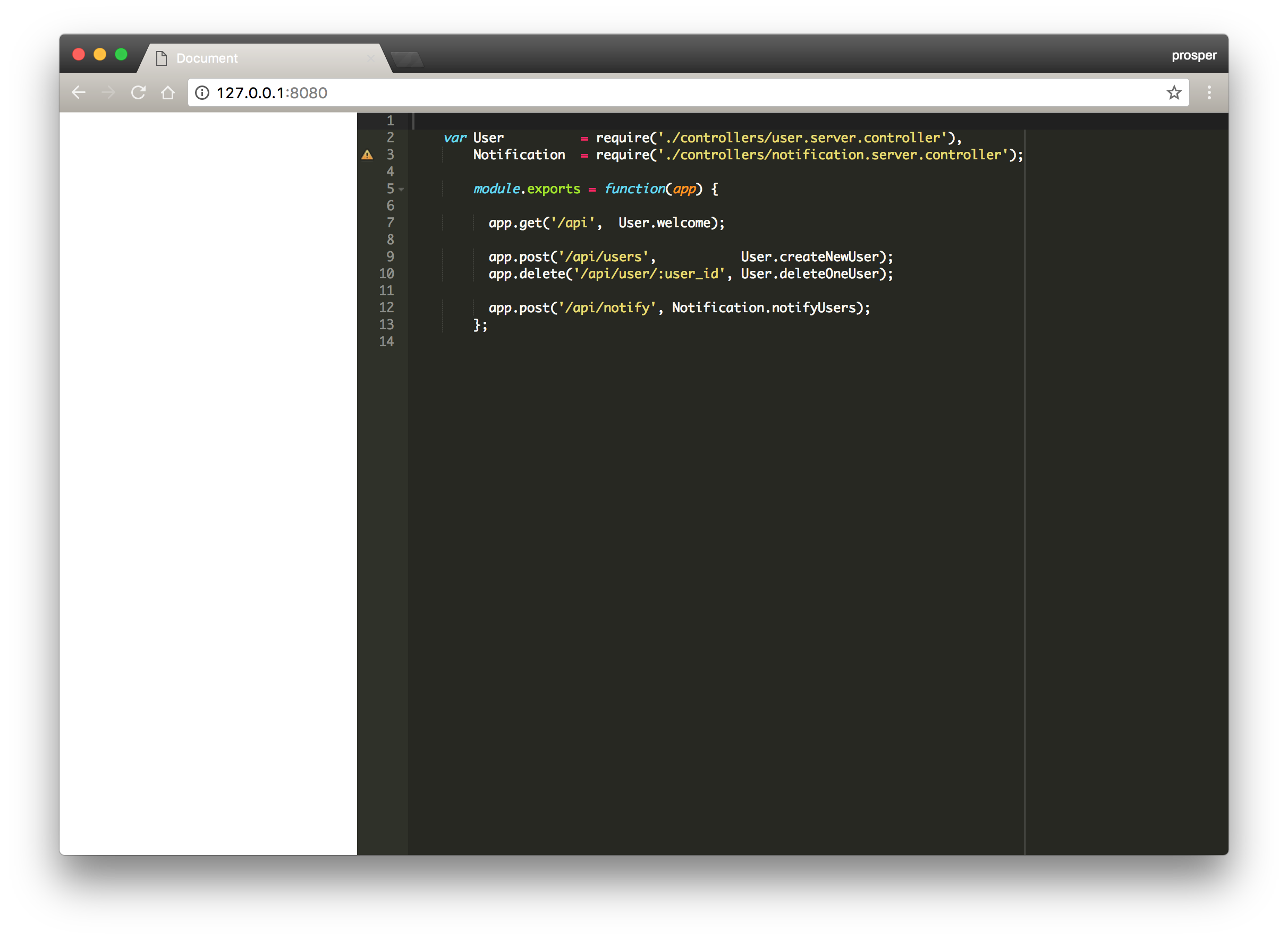
WebcomponentjsWhen you check out your browser, this is how your page will look like:
Follow the documentation here to install and run it in your web browser.
It is that simple. Now we have a code editor in our browser by just importing a Web Component. Whoop! Whoop!
Now, let's go through the Web Components specifications in order to know how to create a custom component, starting from
Custom ElementsHow to create Web Components
Custom Elements
This is a web component specification that defines how to craft and use new types of DOM elements. There are some ground rules on how to name and define your custom elements. They are:
The name of your custom element must contain a dash (-). For example,
, and<file-reader>
are valid names for custom elements, while<skype-login>
, and<skype_login>
are not. This is necessary in order to allow the HTML parser differentiate between a custom element and an inbuilt HTML element.<skypelogin>- A custom element can't be registered more than once. A
error will be thrown if you do so.DOMException - A custom element can't be self-closing. For example, you can't write a custom element like this:
. It should always be written like this:<skype-login />
.<skype-login></skype-login>
A custom element can be created using the
customElements.define()HTMLElementclass FileBag extends HTMLElement { // Define behavior here } window.customElements.define('file-bag', FileBag);
Another option is to use an anonymous class like so:
window.customElements.define('file-bag', class extends HTMLElement {
  // Define behaviour here
});
With this already defined, you can now use the custom element in a web page like so:
<file-bag></file-bag>
You can define properties on a customElement. For instance, let's add an attribute called
open<file-bag>class FileBag extends HTMLElement { // Set the "open" property set open(option) { this.setAttribute("open", option); } // Get the "open" property get open() { return this.hasAttribute("open"); } }
this refers to the DOM element itself. So in this example, this refers to
.<file-bag>
Once you have done this, you can now use the custom element in your browser like this:
<file-bag open="true"></file-bag>
Note: You can also define a constructor in the class, but you have to call the
super()There are lifecycle hooks that custom elements can define during their existence. These hooks are:
- constructor(): Here, you can attach event listeners and initialize state.
- connectedCallback(): Called whenever the custom element is inserted into the DOM.
- disconnectedCallback(): Called whenever the custom element is removed from the DOM.
- attributeChangedCallback(attrName, oldVal, newVal): Called whenever an attribute is added, removed or updated. Only attributes listed in the observedAttributes property are affected.
- adoptedCallback(): Called whenever the custom element has been moved into a new document.
You can reference the custom element specification for a lot more information.
Shadow DOM
This is a powerful API to combine with custom elements. It provides encapsulation by hiding DOM subtrees under shadow roots. You can use Shadow DOM in a custom element like so:
window.customElements.define('file-bag', class extends HTMLElement {
  constructor() {
    super();
    var shadowRoot = this.attachShadow({mode: 'open'});
    shadowRoot.innerHTML = `<strong>Shadow dom super powers for the win!</strong>`;
  }
});
So when you call
<file-bag><p>This is a file bag </p></file-bag><file-bag> <strong>Shadow dom super powers for the win!</strong> </file-bag>
The main idea behind Shadow DOM is to mask all of the markup behind a custom element in the shadows. If you inspect the element in the browser, you won't see any of the markup apart from the attributes of the element. They are hidden under shadow roots. Browser vendors have been using Shadow DOM for years to natively implement elements such as
<input><audio><video>You can reference the shadow DOM specification for a lot more information.
HTML Imports
HTML Imports are a way to include and reuse HTML documents in other HTML documents. The
importrellink<link rel="import" href="/imports/file-reader.html">
You can reference the HTML Imports for a lot more information.
HTML Template
This is a web component specification that defines how to declare pieces of markup at page load.
The
<template>You can reference the HTML Template specification for a very detailed information on templating.
Build a Vimeo Embed Web Component
We'll build a web component that will allow users embed vimeo videos into their apps easily. Let's get started.
Create a new HTML file,
video-embed.html<!-- Defines element markup --> <template> <style> .vimeo { background-color: #000; margin-bottom: 30px; position: relative; padding-top: 56.25%; overflow: hidden; cursor: pointer; } .vimeo img { width: 100%; top: -16.82%; left: 0; opacity: 0.7; } .vimeo .play-button { width: 90px; height: 60px; background-color: #333; box-shadow: 0 0 30px rgba( 0,0,0,0.6 ); z-index: 1; opacity: 0.8; border-radius: 6px; } .vimeo .play-button:before { content: ""; border-style: solid; border-width: 15px 0 15px 26.0px; border-color: transparent transparent transparent #fff; } .vimeo img, .vimeo .play-button { cursor: pointer; } .vimeo img, .vimeo iframe, .vimeo .play-button, .vimeo .play-button:before { position: absolute; } .vimeo .play-button, .vimeo .play-button:before { top: 50%; left: 50%; transform: translate3d( -50%, -50%, 0 ); } .vimeo iframe { height: 100%; width: 100%; top: 0; left: 0; } </style> <div class="vimeo"> <div class="play-button"></div> </div> </template>
We have also added CSS style to the
templatevimeo-embedThe next step is to actually create the custom element. Now add a
<script><template><script> (function(window, document, undefined) { // Refers to the "importer", which is index.html var thatDoc = document; // Refers to the "importee", which is vimeo-embed.html var thisDoc = (thatDoc._currentScript || thatDoc.currentScript).ownerDocument; // Gets content from <template>. var template = thisDoc.querySelector( 'template' ).content; // Shim Shadow DOM styles if needed if (window.ShadowDOMPolyfill) { WebComponents.ShadowCSS.shimStyling(template, 'vimeo'); } class VimeoEmbed extends HTMLElement { constructor() { super(); } connectedCallback() { var shadowRoot = this.attachShadow({mode:'open'}); // Adds a template clone into shadow root. var clone = thatDoc.importNode( template, true ); shadowRoot.appendChild(clone); // get the value of the "embed" attribute var embed = this.getAttribute("embed"); var video = shadowRoot.querySelector( ".vimeo" ); this.createAndPlay(embed, video); } createAndPlay(embedID, videoElem) { videoElem.addEventListener( "click", function() { var iframe = document.createElement( "iframe" ); iframe.setAttribute( "frameborder", "0" ); iframe.setAttribute( "allowfullscreen", "" ); iframe.setAttribute( "webkitallowfullscreen", "" ); iframe.setAttribute( "mozallowfullscreen", "" ); iframe.setAttribute( "src", "https://player.vimeo.com/video/" + embedID + "?autoplay=1" ); iframe.setAttribute( "width", "640"); iframe.setAttribute( "height", "360"); this.innerHTML = ""; this.appendChild( iframe ); }); } } window.customElements.define('vimeo-embed', VimeoEmbed); })(window, document); </script>
We have the
constructorconnectedCallbackcreateAndPlaysuper()HTMLElementThe
connectedCallbackcreateAndPlayIn the
createAndPlayclickFinally we called
window.customElements.define('vimeo-embed', VimeoEmbed);VimeoEmbedvimeo-embedHTML Import
Create an
index.htmlvimeo-embed.html<!doctype html> <html> <head> <meta charset="utf-8"> <title>Vimeo Embed</title> <script src="./bower_components/webcomponentsjs/webcomponents.min.js"></script> <link rel="import" href="vimeo-embed.html"> <style type="text/css"> .wrapper { max-width: 680px; margin: 60px auto 100px; } </style> </head> <body> <div class="wrapper"> <vimeo-embed embed="203909195"></vimeo-embed> </div> </body> </html>
Oh, you can see the
webcomponentsjsInstall it via bower like this:
bower install webcomponentsjs --save
Browser View
From your terminal, run a local server, e.g http-server to serve up the web page.
Your web page should display the component like so:
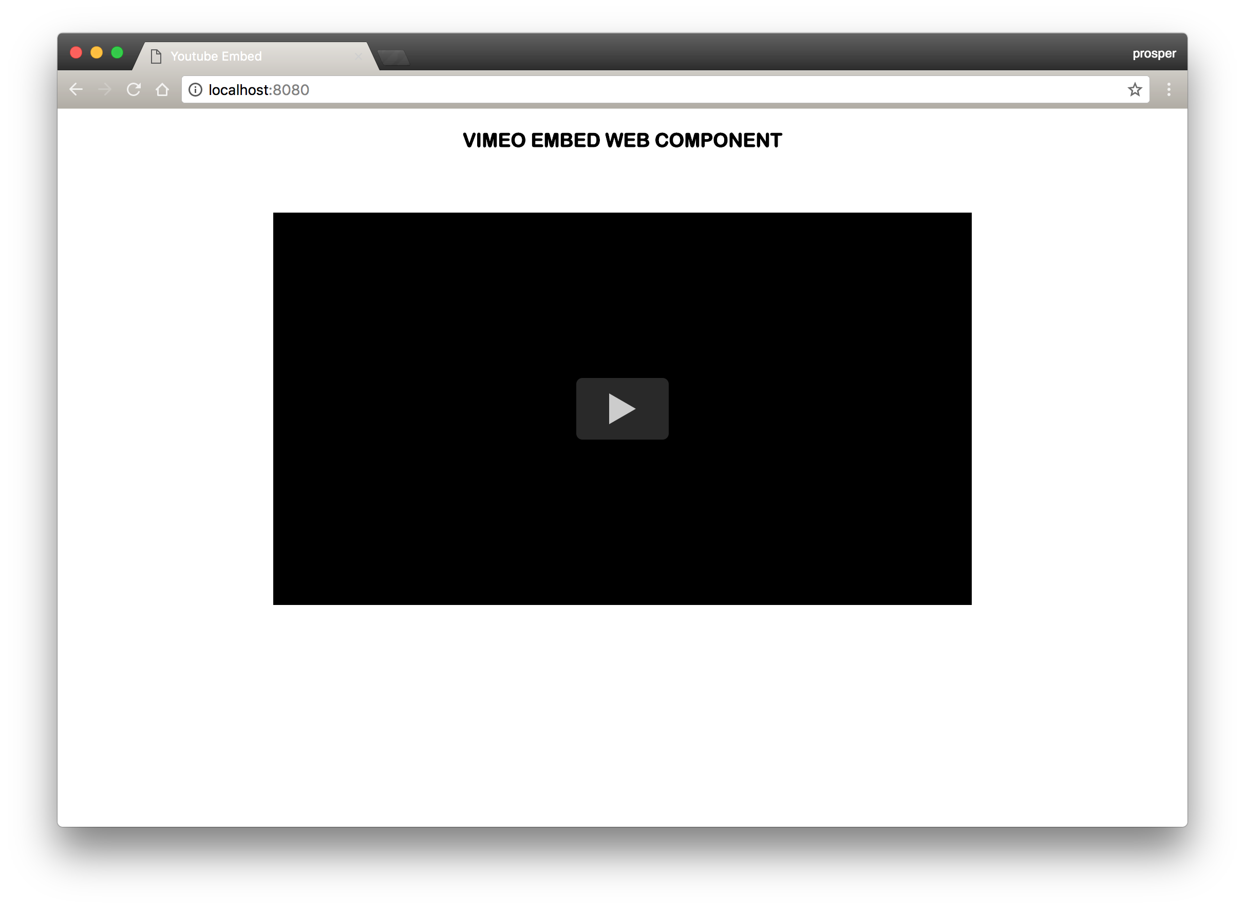
Once you click the play button, the video should autoplay:

Inspect the page with Chrome DevTools, check out the
<video-embed>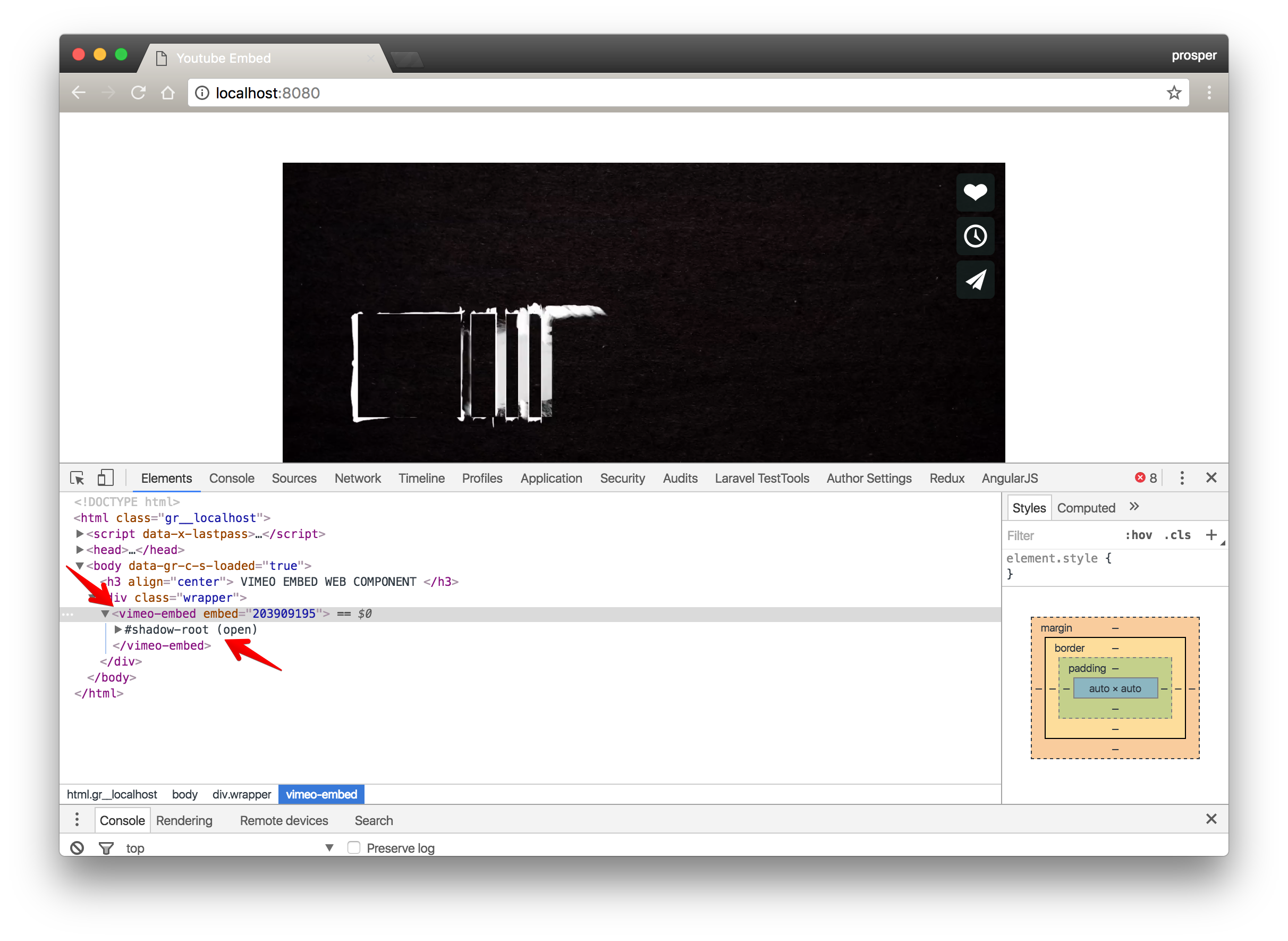
Check out the Shadow DOM below:
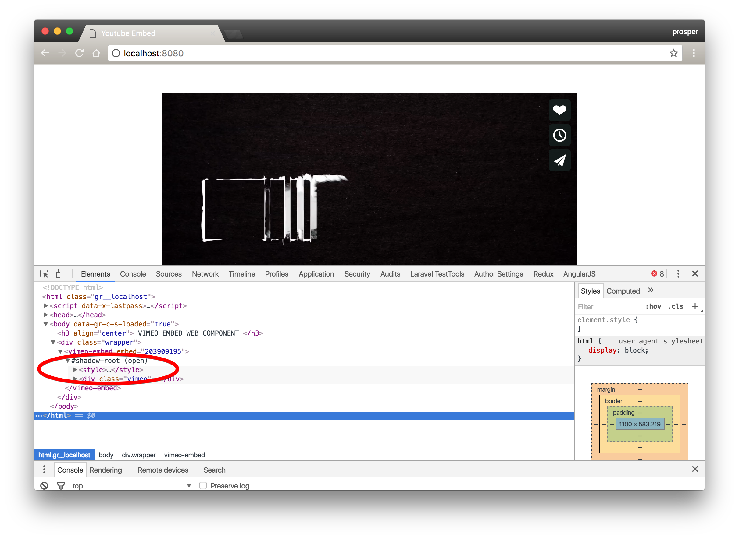
Now that we have a fully functional vimeo embed web component, let's package it and submit to the registry.
Submit To The Web Component Registry
There is a list of requirements to adhere to before submitting your component to the registry. Follow the instructions below:
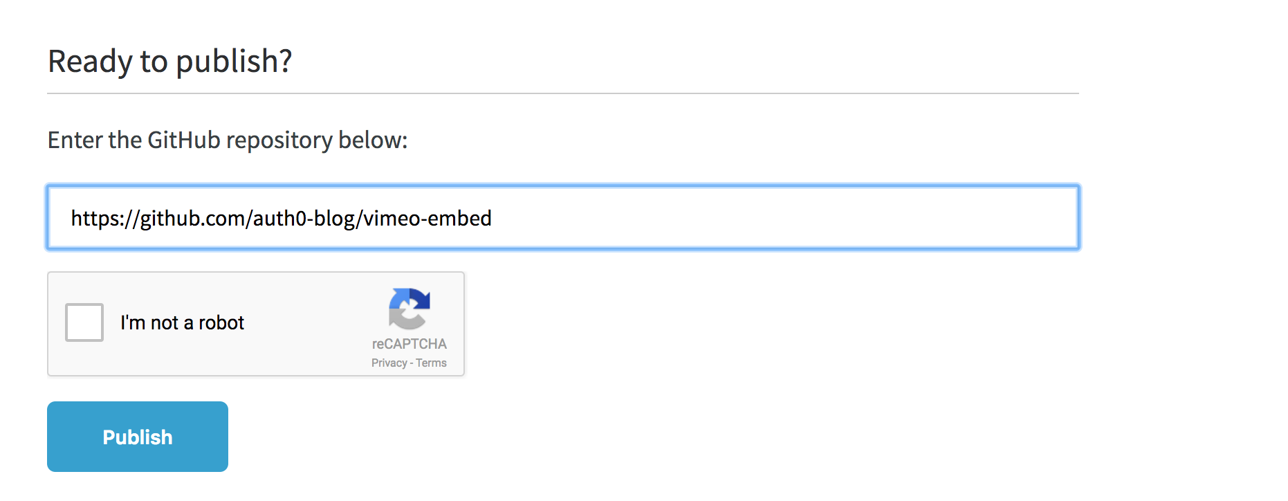
Go ahead and publish
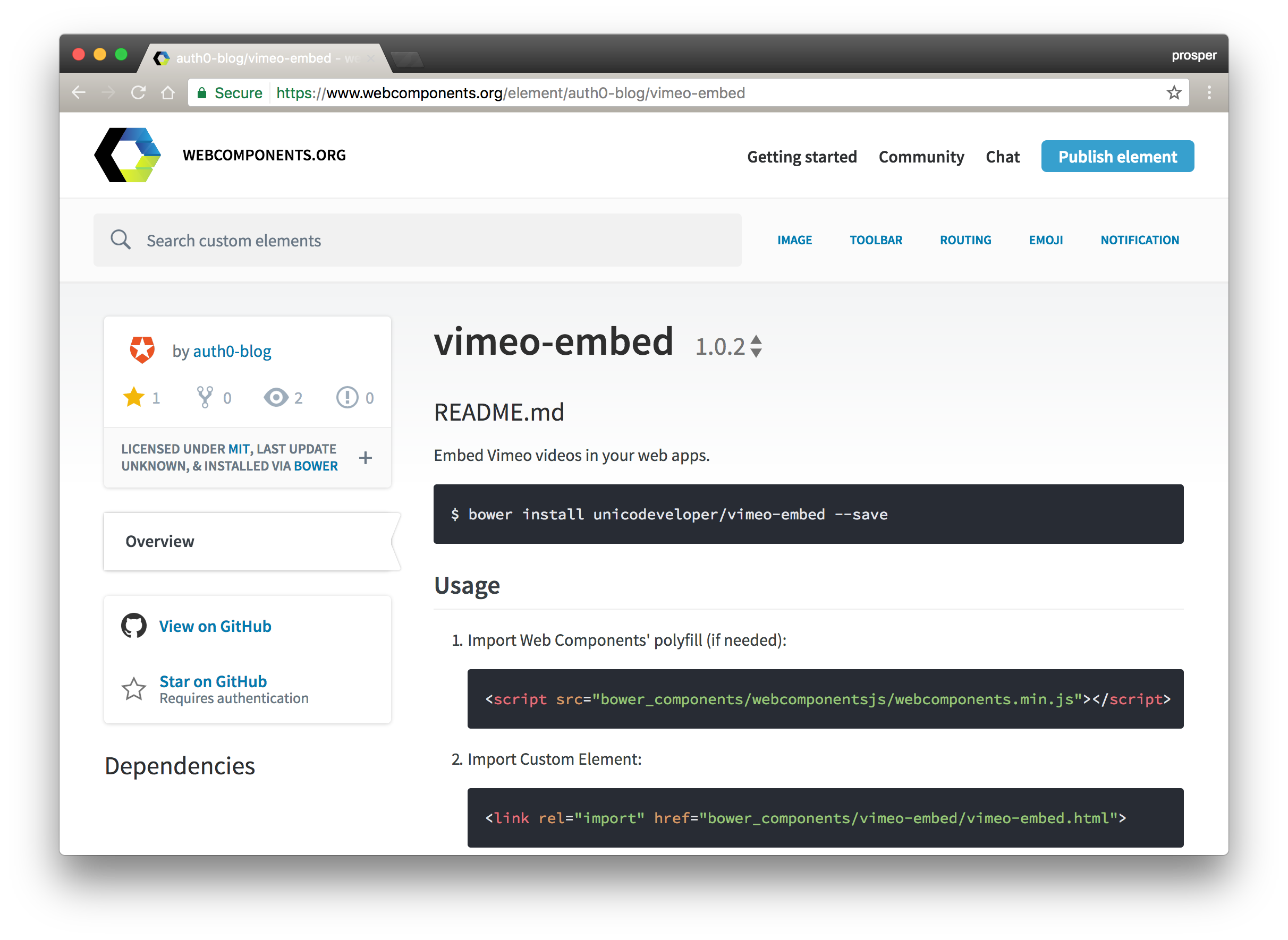
Now, your component should be visible in the registry.
Yaay!
Browser Support for Web Components
Google Chrome is leading the pack of browsers with stable support for Web Components in their web and mobile browsers. Take a look at the browser support matrix below:

To be safe, it is recommended to use webcomponentsjs, to provide support for many browsers.
We used
webcomponentsjsNote: Web Components capabilities are disabled by default in Firefox. To enable them, go to the
about:configTools for Building Web Components
There are libraries available that make it easier to build web components. Some of these libaries are:
- Bosonic
- Polymer
- SkateJS
All the libraries highlighted here offer tools to cut down boilerplate code and make creating new components easier. Polymer and Bosonic also offer a library of ready made Web Components, but Polymer remains the most widely used amongst developers. Check out this awesome tutorial on building apps with Polymer and Web components.
Aside: Auth0 Authentication with JavaScript
At Auth0, we make heavy use of full-stack JavaScript to help our customers to manage user identities, including password resets, creating, provisioning, blocking, and deleting users. Therefore, it must come as no surprise that using our identity management platform on JavaScript web apps is a piece of cake.
Auth0 offers a free tier to get started with modern authentication. Check it out, or sign up for a free Auth0 account here!
Then, go to the Applications section of the Auth0 Dashboard and click on "Create Application". On the dialog shown, set the name of your application and select Single Page Web Applications as the application type:
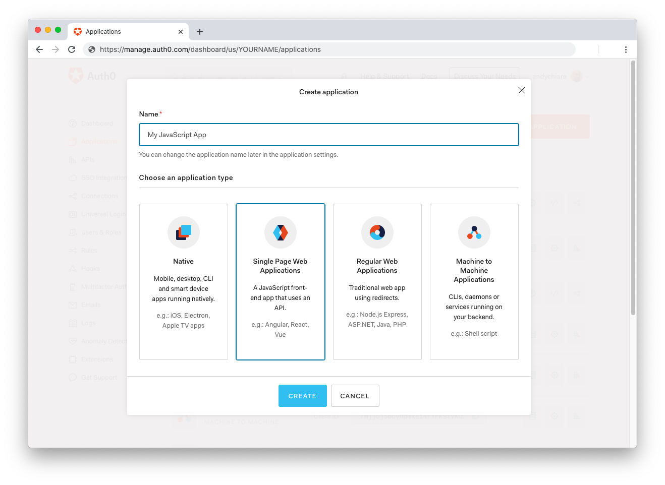
After the application has been created, click on "Settings" and take note of the domain and client id assigned to your application. In addition, set the Allowed Callback URLs and Allowed Logout URLs fields to the URL of the page that will handle login and logout responses from Auth0. In the current example, the URL of the page that will contain the code you are going to write (e.g.
http://localhost:8080Now, in your JavaScript project, install the
library like so:auth0-spa-js
npm install @auth0/auth0-spa-js
Then, implement the following in your JavaScript app:
import createAuth0Client from '@auth0/auth0-spa-js';

let auth0Client;

async function createClient() {
  return await createAuth0Client({
    domain: 'YOUR_DOMAIN',
    client_id: 'YOUR_CLIENT_ID',
  });
}

async function login() {
  await auth0Client.loginWithRedirect();
}

function logout() {
  auth0Client.logout();
}

async function handleRedirectCallback() {
  const isAuthenticated = await auth0Client.isAuthenticated();

  if (!isAuthenticated) {
    const query = window.location.search;
    if (query.includes('code=') && query.includes('state=')) {
      await auth0Client.handleRedirectCallback();
      window.history.replaceState({}, document.title, '/');
    }
  }

  await updateUI();
}

async function updateUI() {
  const isAuthenticated = await auth0Client.isAuthenticated();

  const btnLogin = document.getElementById('btn-login');
  const btnLogout = document.getElementById('btn-logout');

  btnLogin.addEventListener('click', login);
  btnLogout.addEventListener('click', logout);

  btnLogin.style.display = isAuthenticated ? 'none' : 'block';
  btnLogout.style.display = isAuthenticated ? 'block' : 'none';

  if (isAuthenticated) {
    const username = document.getElementById('username');
    const user = await auth0Client.getUser();

    username.innerText = user.name;
  }
}

window.addEventListener('load', async () => {
  auth0Client = await createClient();

  await handleRedirectCallback();
});
Replace the
andYOUR_DOMAINplaceholders with the actual values for the domain and client id you found in your Auth0 Dashboard.YOUR_CLIENT_ID
Then, create your UI with the following markup:
<p>Welcome <span id="username"></span></p>
<button type="submit" id="btn-login">Sign In</button>
<button type="submit" id="btn-logout" style="display:none;">Sign Out</button>
Your application is ready to authenticate with Auth0!
Check out the Auth0 SPA SDK documentation to learn more about authentication and authorization with JavaScript and Auth0.
Note: If you want to use Auth0 authentication to authorize API requests, note that you'll need to use a different flow depending on your use case. Auth0
idTokenConclusion
Web components have a lot more benefits than meets the eye. Web Components allow for less code, modular code and more reuse in our apps.
In my opinion, the major selling point of Web components is reusability and simplicity of use. The more high quality components developers submit to the registry, the more a plethora of better tools will be available to the community for building better and beautiful web apps in less time!
Have you been using Web Components for a while? Do you think Web Components are the future for web app development? Are they just another hipster technology? I'll like to know your thoughts in the comment section.
About the author

Prosper Otemuyiwa
Former Auth0 Employee
